
Boston Real Estate Market 2017 YTD Update
Well the books have closed on the busy 2017 Spring and Summer markets. That makes this a good time to see how 2017 has gone so far and how it compares with the past few years. Oh and we can see how accurate my end of 2016 predictions have turned out to be, or perhaps not to be!
The Highlights
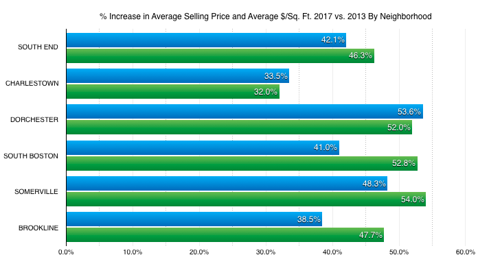
- Past 5 years have seen remarkable price appreciation in every neighborhood
- Dorchester has seen the most in % price appreciation at 52%
- Charlestown has seen the “slowest” % price appreciation at 32%
- Average prices rose every year in every neighborhood
- Price appreciation varied widely from year to year but has never been negative
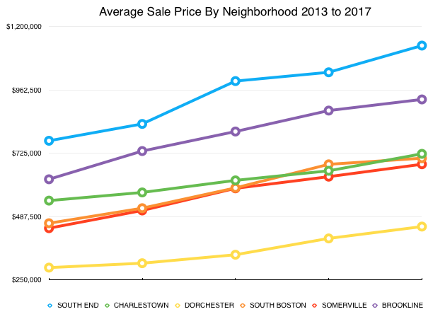
- Average prices today range from $449K in Dorchester to $1.1M in the South End
- Inventory remains incredibly tight everywhere
The Details
In many ways, were are still living the real estate version of the movie Ground Hog Day, as 2017 was very much like the preceding years. Regardless of neighborhood, supply remained steady at best and downright scarce at worst. Demand remained strong pushing prices up across the board and leaving many buyers to fight with each other for the best properties in multiple offer bidding wars. Most properties sold within a week if not mere days of coming on market. It clearly remains a sellers market.
So let’s take a look at how each neighborhood has done so far compared to last year, and how things look compared to 5 years ago in 2013. (First a quick note. Starting with this report, I’m mixing up the neighborhoods a bit and have added Brookline, Somerville and Charlestown to the mix, and dropped the Back Bay since it tends to perform very closely to the South End. As always, if you are curious about any other neighborhoods, just contact me and I’ll be happy to run those numbers too).
The South End – OK I called this one wrong!
Back in January I noted that the rate of price increases for the South End had slowed for 2016, indicating a possible softening of demand. Well, 2017 proved me wrong! YTD average price is up 9.7% and average $/sq. ft. up 11.1%. The total # listings were down slightly at 472 (the lowest level in the past 5 years), keeping competition fierce. This is likely the reason for the return of nearly double digit price jumps.
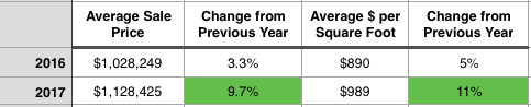
Since 2013, the average sale price in the South End is up a total of over 46% and average $/sq. ft. is up 42%
South Boston – OK I called this one right!
South Boston has been on a strong run for the past 5 years, benefitting from people priced out or cashing out of the neighboring South End. Plus renovations have improved inventory quality and a more active food scene amped up interest in the area. But I warned in my last report that South Boston’s 2016 rock star price performance may largely have been due to unusually low inventory in a neighborhood that typically has more options for buyers than most other locations.
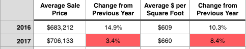
Well in 2017, inventory rose back up to more typical levels, a 24% jump with 615 listings. Sales still climbed as well, but by just 3.3% leaving more inventory for buyers to consider. As a result, price appreciation came back to earth big time, rising just 3.4% with $/sq. ft. up 3.4%, compared to 15% and 10% respectively the year before.
That said, compared to 2013, the average sale price in South Boston is up a total of 52.8%, with price per sq. ft. up 41%!
Dorchester – I Was Right Again!
Dorchester continues to fire on all cylinders. Average sale price rose 11%. True that’s less than 2016’s massive 18% rise but it’s still the biggest rise of all the neighborhoods covered in this report. Even more remarkable, that’s in the face of 25% MORE listings and likely explains the drop from crazy high 18% down to a still high 11%
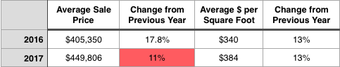
Clearly Dorchester demand has remained strong, since even with 25% more inventory, sales rose 35% making supply thinner than ever. Interestingly average $/sq. ft. rose the same as last year, a robust 13%, reflecting not only high demand but the continuing improvement in the renovation quality available.
Since 2013, Dorchester is up 52% in average sale price and 53.6% in average $/sq. ft. That gives Dorchester the title for largest increase in $/sq. ft. of all the neighborhoods, and 2nd place for increase in average sale price.
Charlestown – Steady as She Goes
With so many of my clients choosing Charlestown over the past few years it’s well time that I included it in my market reporting. What’s interesting here is while inventory has bounced around pretty wildly on occasion, prices have increased at a steady pace.
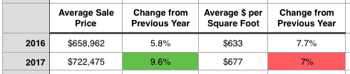
So far in 2017, average sale price is up 9.6% and average $/sq. ft. up 7%. That’s mixed compared to 2016 were average price was up a bit less at 5.8% but average $/sq. ft. was up a bit more at 7.7%
Since 2013, Charlestown average sale price is up 32% with average $/sq. ft. up 33.5% Those are respectable numbers but in comparison to the other neighborhoods covered here, that puts Charlestown at the back of the pack.
Somerville – The 5 Year Appreciation Front Runner
Like Charlestown, lot’s of my clients are choosing Somerville to call home. So Boston’s more densely populated and very diverse neighborhood joins this report for the first time.
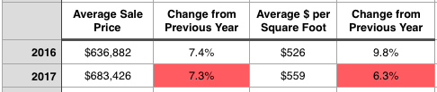
In 2017, Somerville turned in a respectable 7.3% average price increase, just a hair shy of 2016’s 7.4%. Average $/sq. ft. was up 6.3%, a drop from 2016’s 9.8% jump. That may be because # of listings were up somewhat from 2016 so there was a tiny bit less pressure.
From 2013 to 2017, Somerville turned in a record 54% increase in average sale price making it the neighborhood with the highest appreciation over the past 5 years. Average $/sq. ft. increase was 48.3% putting it just behind Dorchester’s #1 spot.
Brookline – The Urban Suburb
Last but not least, I decided to add Brookline to the list since many of my clients tend to look there when public school quality is a priority as well as proximity to downtown. Not surprisingly, it’s also pricey with an average condo selling price of $926,508, just behind the South End’s $1,128,425 and well ahead of 3d place Charlestown at $722,475.
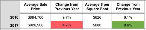
Perhaps for this reason, Brookline had relatively modest price gain of 4.7% in average selling price. $/sq. ft. however rose a solid 8.6%.
Since 2013 Brookline prices are up 48% while average $/sq. ft. is up 38.5%. This puts Brookline about middle of the pack out of all the neighborhoods covered here.
And The Winner Is?
Well, that would be anyone who owned anything over the past 5 years! No matter which neighborhood you bought in back in 2013, you would have on average seen your property go up at least 33.5% (Charlestown) or as much as 54% (Somerville) by 2017.
What’s interesting is in 2013 Dorchester was the least expensive of the 6 neighborhoods, the South End the most expensive. In 2017, that’s still true. In fact all of the neighborhoods are in the same order in 2017 as they were in 2013. For a brief period South Boston pulled ahead of Charlestown and Somerville, its closest competitors, but by 2017 Charlestown was back in 3rd place, with Southie in 4th and Somerville in 5th, as they were in 2013.
Perhaps most notably, every neighborhood enjoyed rising prices every year – there wasn’t a single down year.
So What About Fall 2017 and 2018?
While there’s no 100% certainty in predicting the market, unless we have a surprise surge in inventory, I see little reason for Fall 2017 or 2018 to be radically different than 2017 has been so far.
Sure some neighborhoods may see slightly higher or lower appreciation rate but I expect our 5 year positive growth streak to continue for at least the next year. I also expect the rates of price appreciation to be strongest in Dorchester and Somerville due to their lower average prices to begin with, as buyers keep getting pushed out of the most expensive locales.
The area economy and interest rates will play a key part of course. But short of a massive external economic shock, I don’t expect any radical shifts from our overall positive trend with varying degrees of intensity depending on supply and demand shifts. If by any chance it starts to look like that pattern is changing, rest assured you’ll be hearing about it from me!
So What’s a Buyer or Seller to Do?
Good question! That depends on who you are…
If you are thinking of trading up, this is a darn good time to get off the sidelines and sell. Sure your place may be worth more next year, but so will the place you are buying!
If you are holding rental property and don’t plan to keep it long term, selling now may make even more sense as the one place we do see a glut of supply is rental housing, particularly at the high end. And so the rental market has seen some softening and there’s still lot’s more new rental inventory under construction.
If you have been thinking of buying, buy now! . You can see it in the charts above, waiting has NEVER been a good strategy over the past 5 years since prices have risen each and every year.
No matter if you are a buyer, seller, or investor, I hope you have found this report useful. And if you know of anyone who would enjoy this report, let me know and I’ll be happy to send them this and future editions!
I’d love to hear what you thought of it too, and I’d be happy to run the same analysis on your town or neighborhood. Just fill out the form below and let me know your thoughts or how I can help you with your real estate needs!
(In this report we took a look at 2017 on a neighborhood by neighborhood basis. Note all numbers are year to date within each year – e.g. Jan 1 – Sept 25 2016 vs. Jan 1 – Sept 25 2017, so we have an accurate year to year comparison. The actual final numbers for the year may shift somewhat once the entire year is finished. Also note these numbers span entire neighborhoods. Certain hot spots (e.g. Somerville’s Davis Square, Dorchester’s Savin Hill, etc.) may have performed much more strongly while some other neighborhood sections will look like relative bargains. Again, happy to run hyper-local numbers for those of you who would like them. All numbers represent condo sales, as reported by MLSPIN. The calculations, explanations, and predictions are mine.)